Meesho Revamps Brand Identity to Reflect its Inclusiveness and Aspirational Value
Meesho, India’s leading social commerce platform, has revamped its brand identity to reflect its commitment to inclusivity and its goal of becoming a one-stop horizontal platform for Indian shoppers. The new branding was unveiled on June 8, 2023, and includes a new logo, color palette, and sonic identity.
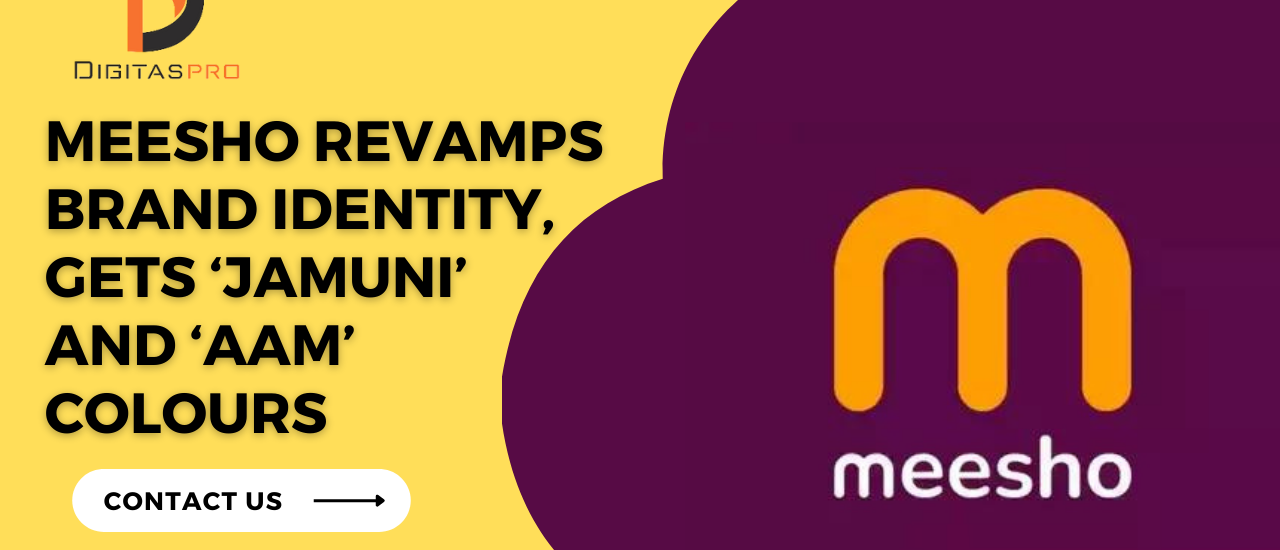
The new logo features hues of “Jamuni” and “Aam.” Jamuni is a deep purple color that is associated with aspiration, while Aam is a bright orange color that is seen as inviting and welcoming. The company says that these colors represent the vibrancy and grandeur of India’s diversity.
The new sonic identity is a “ting tong” sound that is meant to evoke feelings of joy and anticipation. The sound is inspired by the sound of a doorbell, which is often associated with the arrival of a package.
Meesho’s Founder and CEO, Vidit Aatrey, said that the new brand identity “symbolizes our transformation into a genuinely inclusive and egalitarian e-commerce platform.” He added that the new branding “will add a powerful new dimension to our brand identity, a critical component of how people recognize Meesho today and in the future.”
The rebranding exercise was carried out by Landor & Fitch, a global brand consultancy firm. The firm said that it worked with Meesho to create a brand identity that was “authentic, inclusive, and aspirational.”
The rebranding of Meesho comes at a time when the company is looking to expand its reach and grow its user base. The company currently has over 100 million users and is growing rapidly. The new branding is seen as a way to help Meesho attract new users and solidify its position as a leading e-commerce platform in India.
In addition to the new logo, color palette, and sonic identity, Meesho has also launched a new website and app. The new website and app are designed to be more user-friendly and intuitive. They also feature a wider range of products and services.
The rebranding of Meesho is a significant milestone for the company. It reflects Meesho’s commitment to inclusivity and its ambition to become a leading e-commerce platform in India.
Here are some of the key takeaways from Meesho’s brand revamp:
- The new logo is designed to be more inclusive and welcoming.
- The new color palette reflects the vibrancy and grandeur of India’s diversity.
- The new sonic identity is meant to evoke feelings of joy and anticipation.
- The rebranding is seen as a way to help Meesho attract new users and solidify its position as a leading e-commerce platform in India.
Here are some of the benefits of Meesho’s new brand identity:
- The new logo is more memorable and distinctive.
- The new color palette is more vibrant and appealing.
- The new sonic identity is more engaging and memorable.
- The new branding is more inclusive and welcoming.
Overall, Meesho’s brand revamp is a positive step for the company. The new branding is more inclusive, aspirational, and memorable. It is also more likely to resonate with Indian shoppers. The rebranding is a sign that Meesho is committed to its growth and success.
Here are some of the challenges that Meesho may face with its new brand identity:
- The new logo may be too complex for some users.
- The new color palette may be too vibrant for some users.
- The new sonic identity may be too repetitive for some users.
Overall, Meesho’s brand revamp is a positive step for the company. However, the company will need to carefully monitor how the new branding is received by users. If the new branding is not well-received, Meesho may need to make adjustments.
I hope this blog post has given you a more detailed look at Meesho’s brand revamp. If you have any questions, please feel free to ask.